

By Hannah Truby
From Ari Schneider’s Stolen Headstones, to the pages of issue 206, Art Director John Coleman takes us behind the scenes of making stories work in print.
“There are a lot of moving parts and my experience as a newspaper journalist taught me how to balance several things at once while on a deadline,” John says. “The goal is to support the story, not compete with it.” - Mountain Gazette Art Director John Coleman
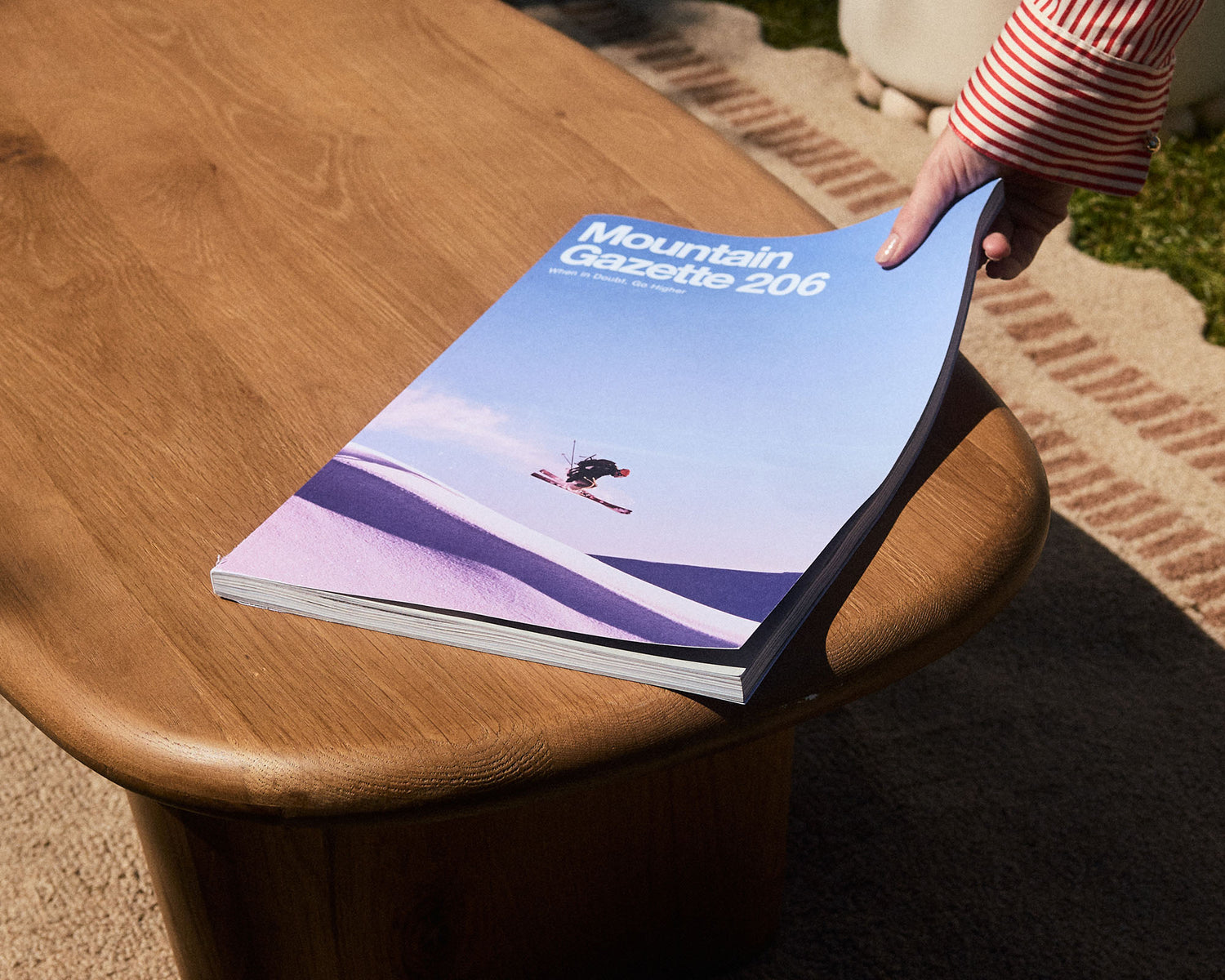
Mountain Gazette 206 is making its way to readers—and Art Director John Coleman is already thinking about the next issue.
That’s the nature of print: One hundred and ninety two pages have to be designed, proofed, color-checked, and sent to the printer, even as the next round of stories is already taking shape.
But 206 wasn’t the only publication occupying John’s screen this time around. He was also designing Stolen Headstones, Ari Schneider’s expanded account of a story that first appeared in Mountain Gazette 203.
The two projects couldn’t be more different in scale and structure. One takes a single story and gives it an entire book; the other has to make room for dozens of stories, photographs, illustrations, and advertisements, all while maintaining the visual language that makes Mountain Gazette feel like Mountain Gazette.
 Stolen Headstones was only the second book John had designed (the first being Print Ain’t Dead, the anthology Mountain Gazette published in 2025). Compared with the magazine, a book presents a much more focused design problem.
“There are far fewer words per page so the biggest consideration was font size and page margins,” John says. Stolen Headstones is a standard 5.5-by-8.5-inch book, but he wanted to make use of the space around the text, too. “I wanted there to be a good amount of white space to invite a comfortable reading experience.”
That restraint was especially important for Schneider’s story. Stolen Headstones expands on Schneider’s account of his family history through the Holocaust, spanning five countries and moving beyond the confines of a magazine feature.
“The story is so powerful and personal, we didn’t want extra visual elements taking away from the flow,” John says. “Photos are sparse, black-and-white archival images that Ari provided. They’re essential to the story so we placed them throughout the chapters to add important context rather than group them in the center pages like some books do just to provide a visual break.”
There were smaller design decisions that mattered too. Schneider’s exhaustive research meant the book was filled with carefully cited sources, so John had to make sure the subscripts were formatted correctly. The references ultimately moved to the end of the book rather than the end of each chapter.

Stolen Headstones by Ari Schneider is available to pre-order now. Limited first printing of 2,000 copies. Ships Holiday 2026.
“Again, this decision was made so the flow of the story felt continuous and wasn’t interrupted by references,” John says. “I just feel honored to have been able to work on it. I think people will really love it.”
For the magazine, meanwhile, the challenge is almost the opposite: creating cohesion from an enormous variety of material.
And with Mountain Gazette 206, there’s a lot to fit in: new work from Steve Martin and Harry Bliss, including an original Bliss painting of a missing avalanche dog; Steve Rinella on the American buffalo; the story of former ski executive Gerard Robard’s transition from ski racing to bread making; a search for Bigfoot in the Pacific Northwest; a 16,000-plus-word piece by Marc Peruzzi about the life of Jeremy Nobis; snark from the Jaded Local; a Norman Rockwell gallery; and a celebration of Mountain Gazette’s 60th anniversary by former editor M. John Fayhee.
For John, that’s the fun part.
“Gosh, everything’s just so good,” John says as he scrolls through the 192-page issue on his computer. It’s a file so large that even his “very souped-up” Mac starts to struggle. “It’s just a really nice mix editorially; light-hearted stories and heavier reads, some awesome art and photography, of course.”

John’s background makes him particularly suited to the crossover between editorial and design. He studied magazine journalism and minored in graphic design, which he describes as “the combination of my two passions in a lot of ways.”
“I love that I can use some journalistic background in the pages as I’m laying out stories.”
That means thinking about design as part of the storytelling process, not just making a page look good, but figuring out how photographs, artwork, and words work together. It also means keeping track of all the moving parts behind the pages.
“My job as art director is as much about laying out the pages as it is communicating with our team and our contributors,” John says. “There are a lot of moving parts and my experience as a newspaper journalist taught me how to balance several things at once while on a deadline.”
One of his favorite design challenges in 206 was Peter Fisher’s ice-fishing story. (Fisher photographed 205’s cover story, “Seeking Boundaries.”) MG sent Fisher to North America’s largest ice-fishing contest in Minnesota, and he came back with so many photographs that the challenge became: How do you fit all those images into the magazine while still giving readers a sense of what it actually felt like to be there?

“There were so many selections that we wanted to really give folks an idea of what this tournament is like and what you might see there,” John says. “And there were just so many images that we were able to sort of squeeze in this kind of mosaic.”
The resulting spread brings together wide shots, details, and photographs of the people participating in the tournament.
“Throughout our photos and galleries, the goal is to tell the story without words. We want readers to get a sense of the human story behind it.”
That approach is part of the visual thread that runs through the magazine.
“I think the visual thread is the template that we established from the get go,” John says. Headlines and subheads use the same fonts throughout the magazine, while serif body type keeps the long-form stories readable. It’s a system designed to hold together everything from a photo gallery to a 10,000-word story without making every feature feel like a different publication.
And that consistency leaves room for the stories themselves to take the lead. John is careful about not pushing the design too far. If every feature gets an elaborate visual treatment, he says, it can start to feel kitschy. The goal is to support the story, not compete with it.
The magazine and the book may require different approaches, but they’re ultimately solving the same problem: How to turn a collection of words and images into something a reader can move through, hold onto, and remember.
Speaking of things worth holding onto, the issue comes with a few surprises, including a poster and a new sticker sheet featuring designs by The Dead Dirtbag.
And while 206 is nearly in readers’ hands, the work doesn’t really stop. After the new year, John and the team will start working from the “boards”—a page-by-page roadmap showing which stories and galleries will occupy the next issue.
Ah, the business of print: one issue out the door, another already underway. And we wouldn’t have it any other way. Thanks for coming along for the ride.

Heard enough?
Subscribe today and get two 192 page journals packed with large format photography, stories, cartoons, and very few ads.
We promise you won't be disappointed.